Revisiting
2026 was my second year as point-designer for intramural programs and final year working at OSU Recreational Sports. The year before, I implemented major changes to the look and feel of intramurals marketing in one of my most ambitious design projects up to that point. I felt challenged this year to leave Rec Sports having bested myself.
The Goal
Design and apply a new and improved visual identity to OSU intramurals marketing for the 2026 school year.
Reworking
What's Staying
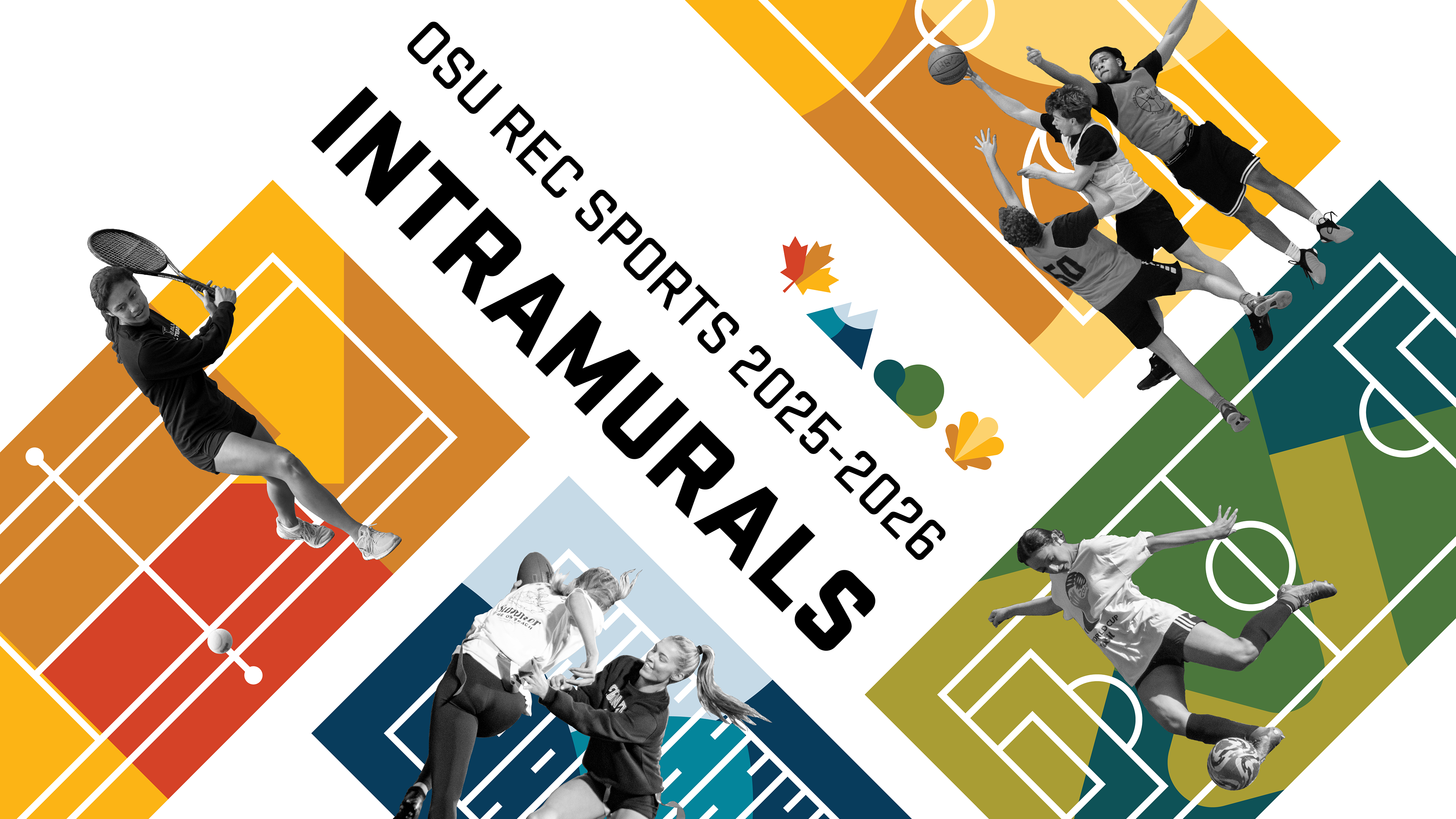
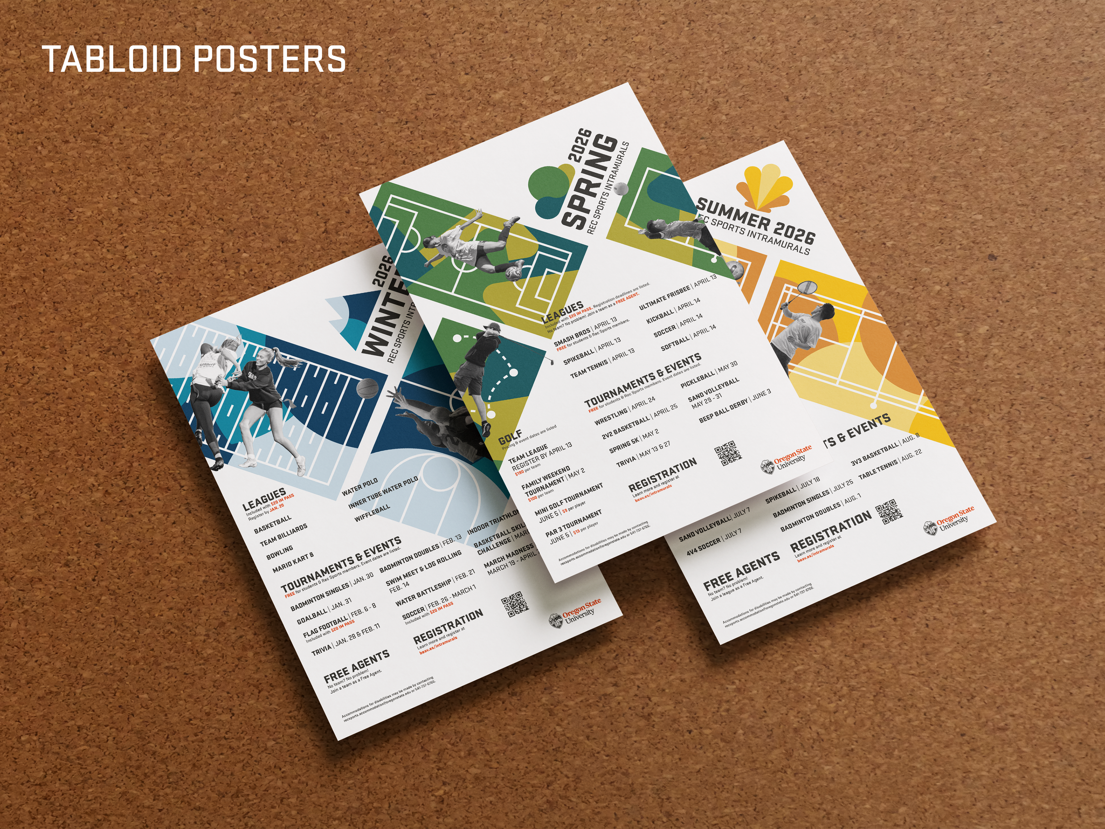
The most compelling part of the first intramurals rebrand was the use of photomontage. The new brand would continue to center images of actual OSU students playing the sports being promoted, combined with abstract graphical elements to convey movement and place. The university brand guidelines would be observed the same way, preserving the style of typography and seasonal color palettes.
What's Changing
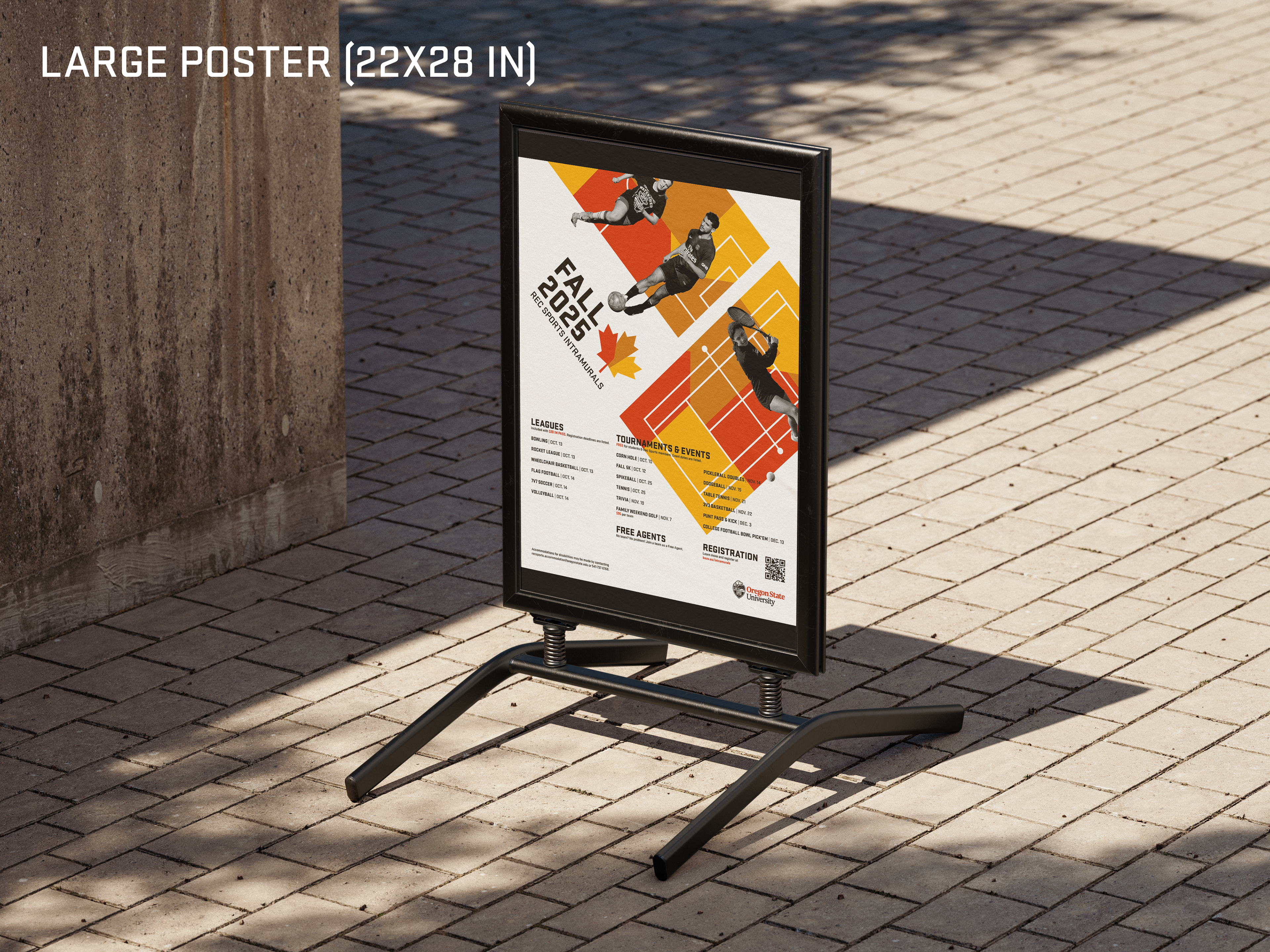
The general promotion of my first intramurals project was very type-centric, with columns of text covering whole screens and posters while other elements interacted at the margins. For this edition, I wanted a more equal balance between the prominence of imagery and text that brings audiences in visually. I was also inspired to replace vague abstract shapes and colors interacting with photograpy with something more elaborate and concrete.

Redesign
Inspirations
I took more conscious inspiration in this rebrand from athletic-adjacent brands that utilize a bold, clean visual identity, such as in sports drinks and apparel. I also looked to past and present sporting institutions, especially the graphic charter of the Olympics.
Visual Language
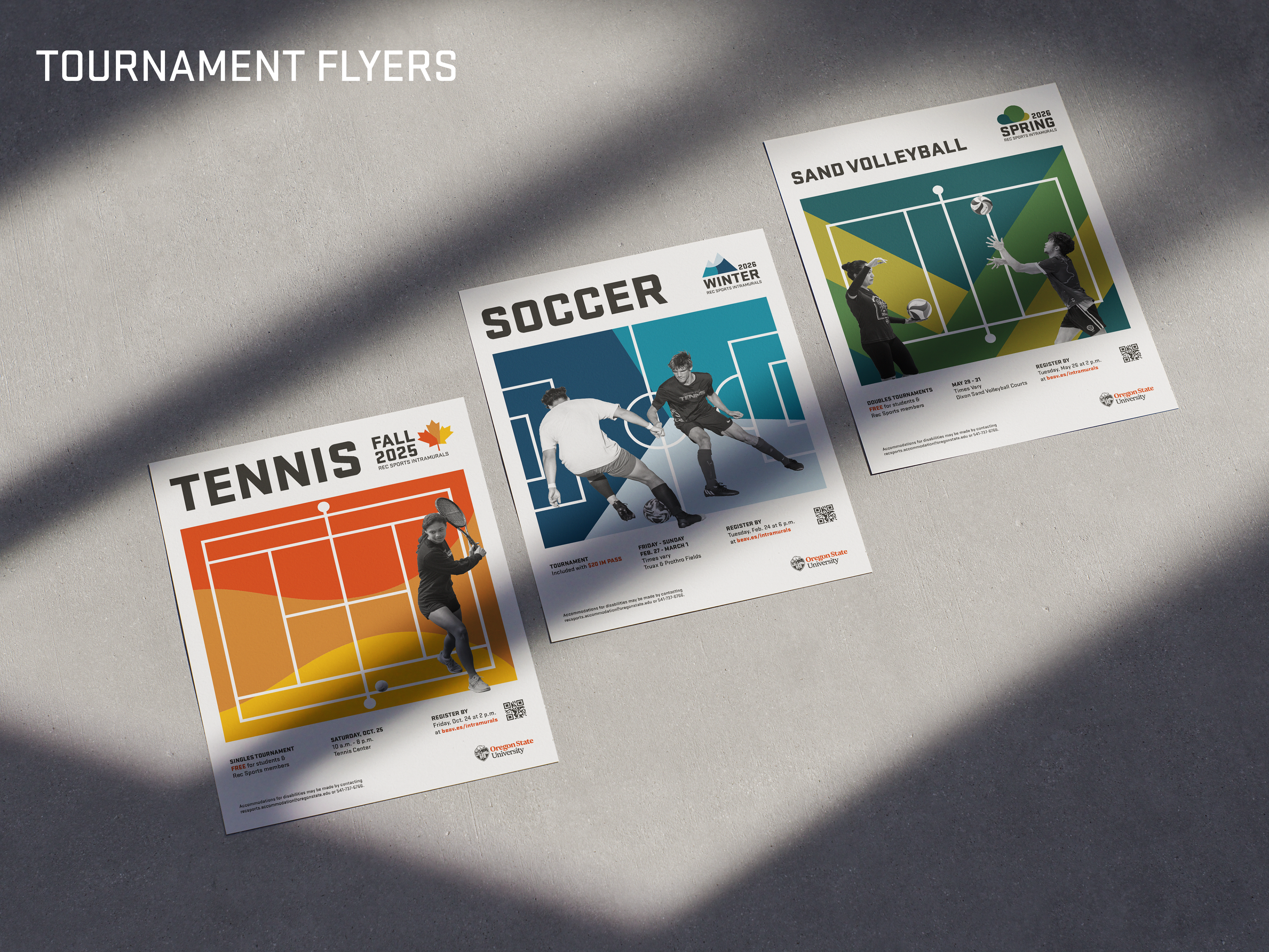
The new brand neatly organizes space between photography, illustration, and informational text. All three components layer and interact with each other to give a sense of movement and depth. I replaced the use of abstract shape and color with geometric illustrations of sports fields and courts that give the student photography a sense of place.